Driving efficiency for design & development teams at Felix with a cross-platform design system
Role
Product Design Lead,
Design Systems
Timeline
May–September 2022 (MVP)
September 2023–April 2024
Team
Head of Marketing
Frontend Development Lead
2× Frontend Developers
Skills
Systems Thinking
Documentation
Cross-platform UI
SUMMARY
Scaling a design system from 0→1 as the first design hire for Felix
I built a scalable design system adopted across design and development to power Felix's desktop, tablet, and mobile products—supporting a payment platform that handles tens of thousands of concurrent payments.
BACKGROUND
Felix Payment Systems is a fintech startup building tech that allows smartphone devices to act as payment terminals.
Their two primary products are Terminal (for payment acceptance) and Portal (for businesses to manage and view records of their transactions).
PROBLEM
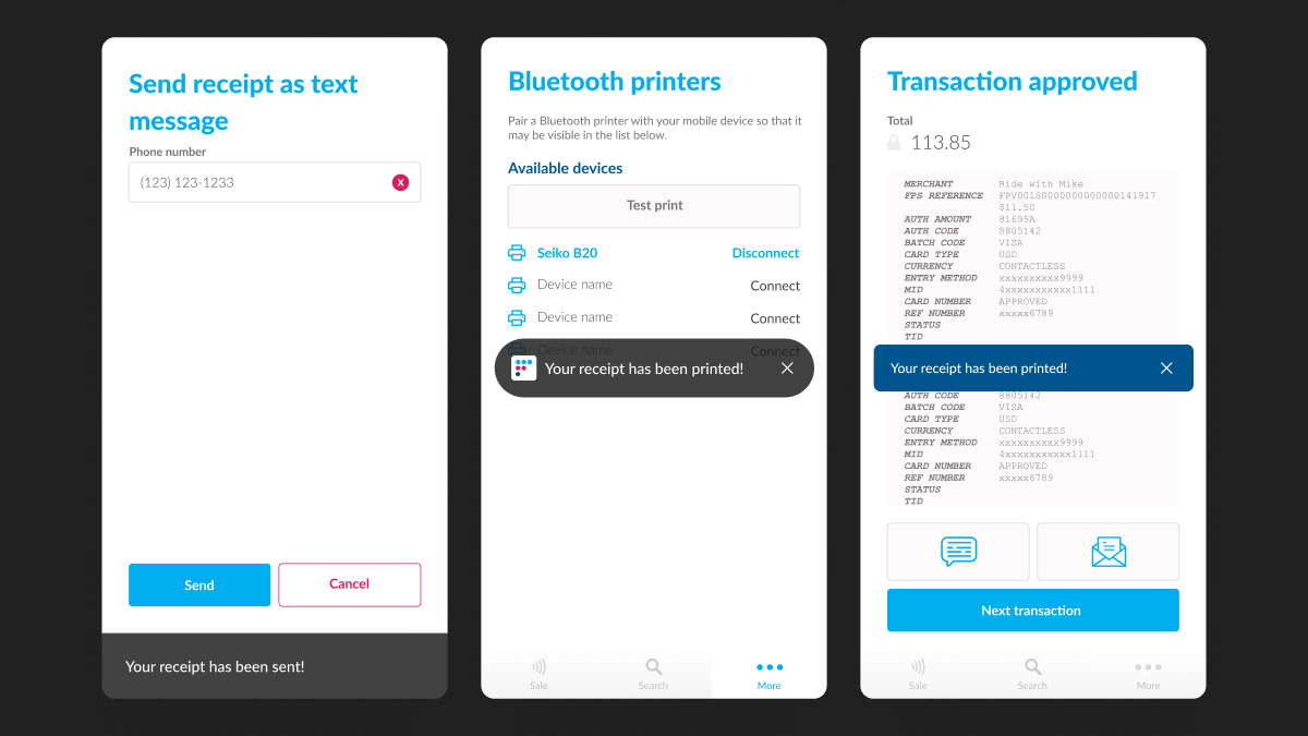
No source of truth for design, creating inconsistencies across Felix products
Early on, I noticed a lack of clear design guidelines for foundations like spacing, color, and typography. These inconsistencies created noticeable visual misalignment across the different products at Felix.
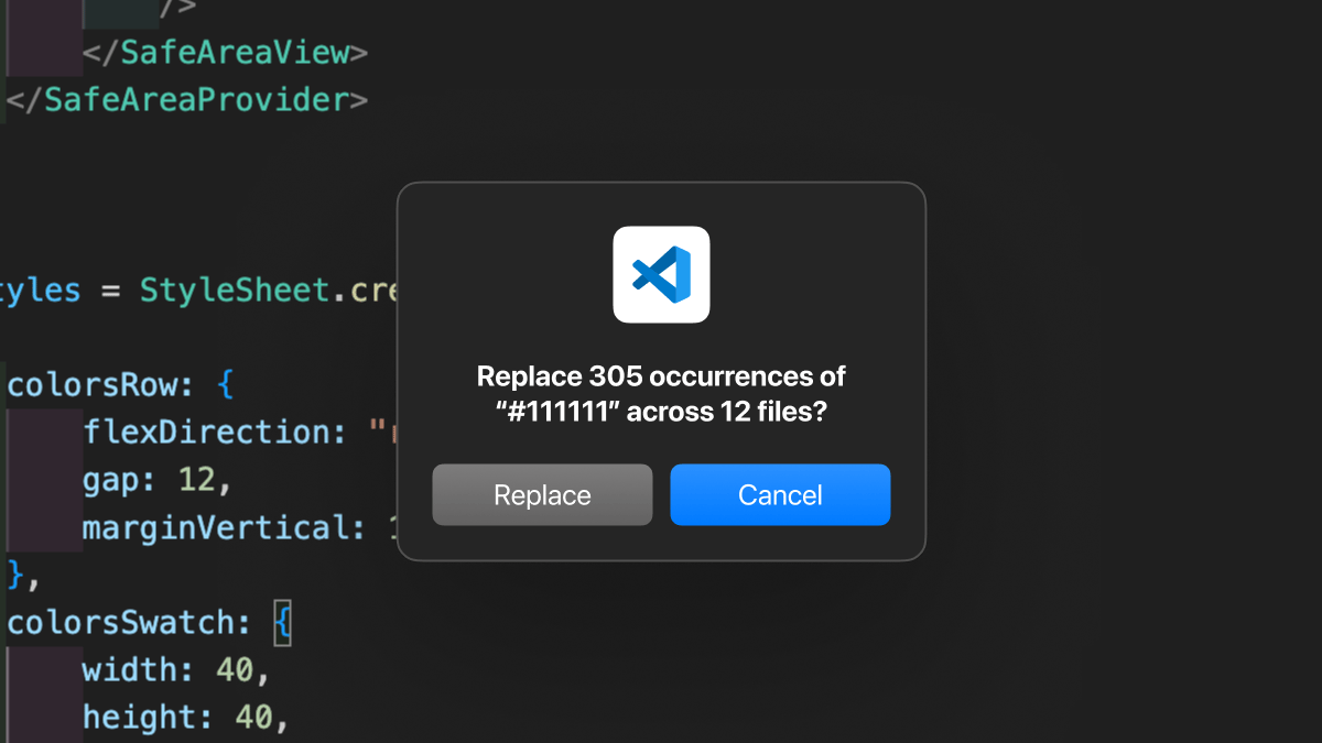
Hardcoded values made the codebase challenging to maintain
Typography, color, and spacing were hardcoded across the codebase, making even simple changes require heavy refactoring.
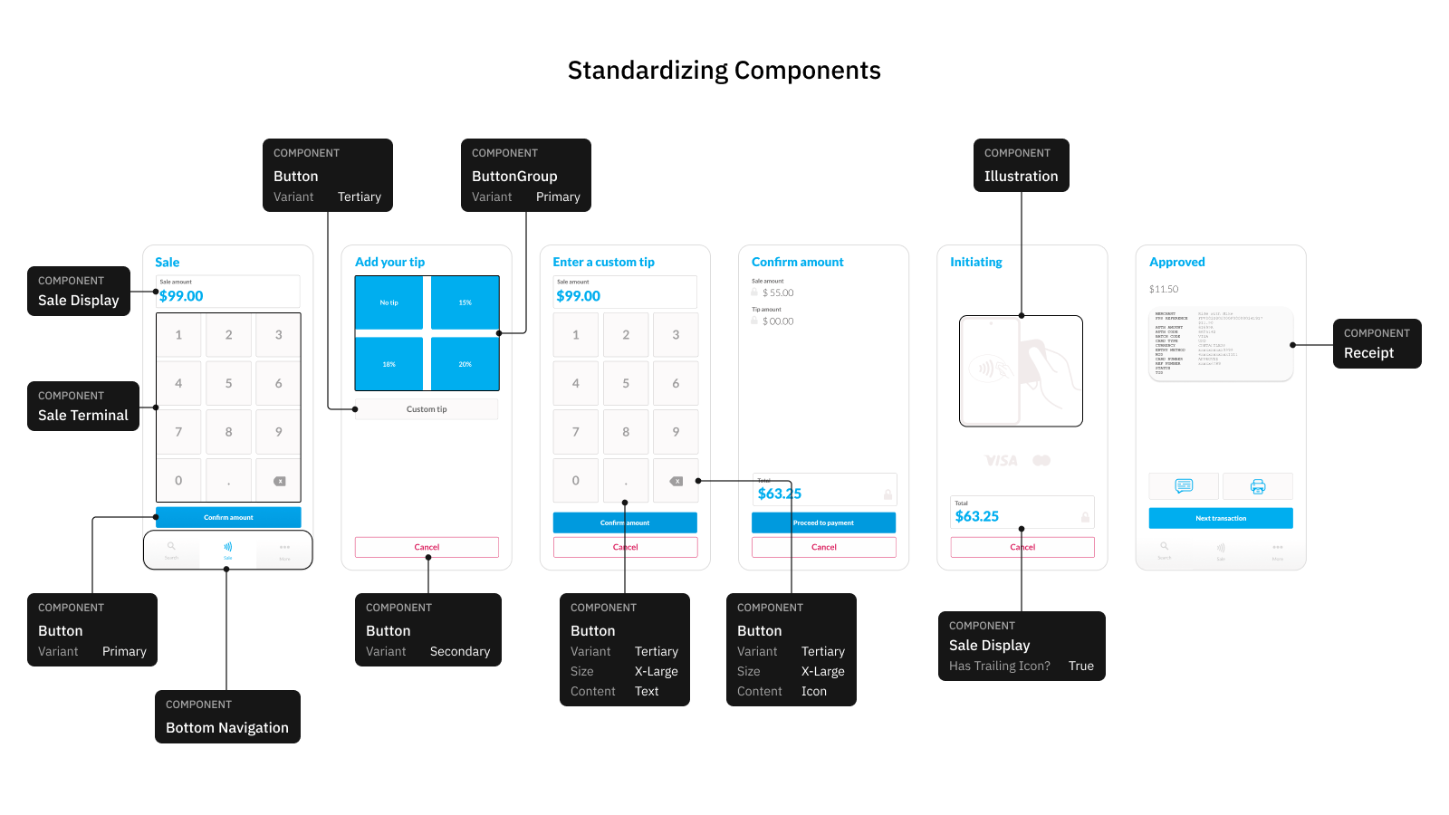
Lack of foundational components resulted in more development time and effort
Without a component library, developers often duplicated existing components or had to spend time identifying reusable ones.
How might I improve the design process so that frontend developers have an easier time translating mockups into frontend code?
LEARN MORE ABOUT WHAT I DID BELOW
WHAT I DID
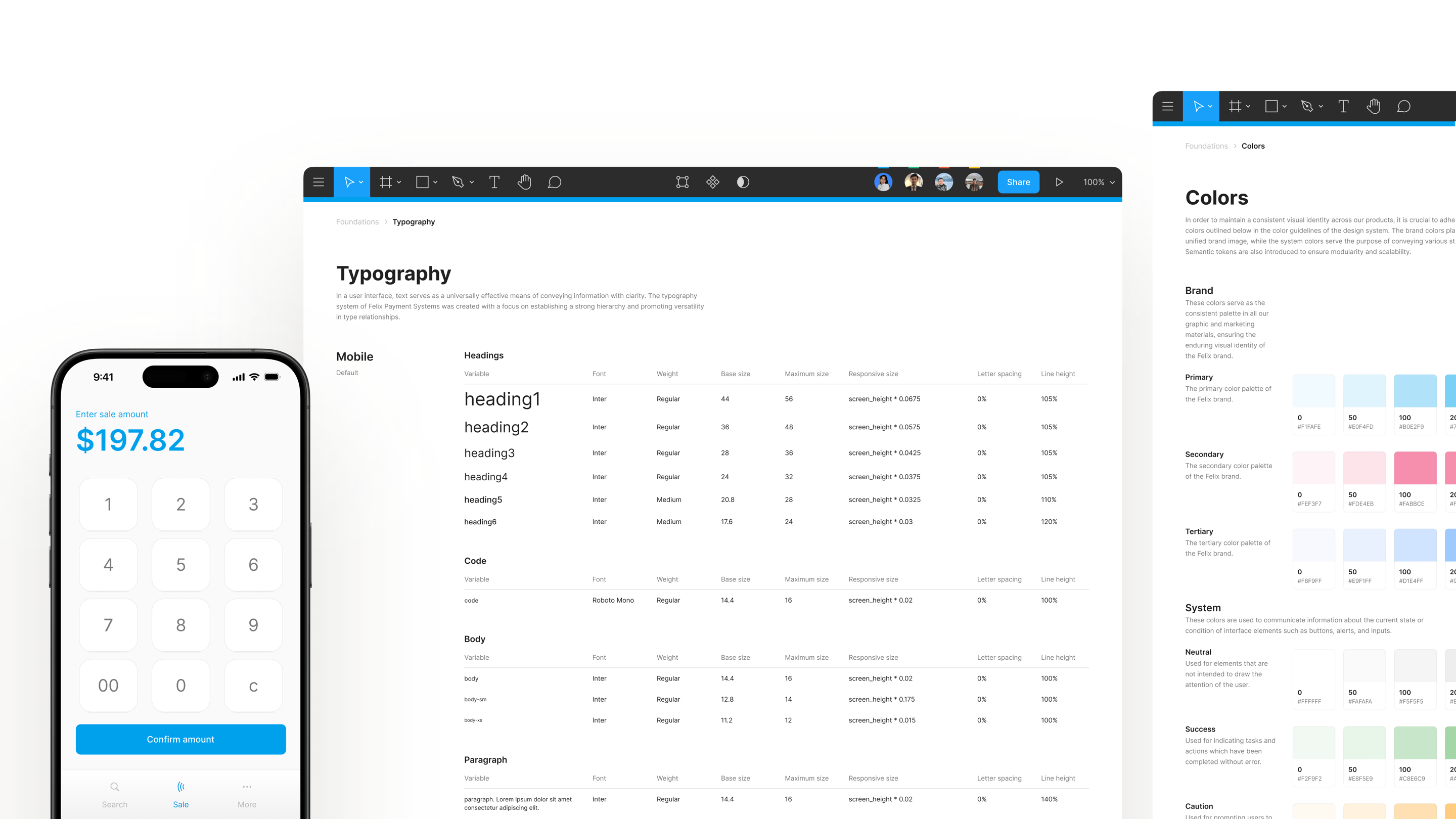
I’m unable to share the original component guidelines due to an NDA, but I’ve recreated key pages for reference. For details on the full project, please reach out via email at christinaraganit@gmail.com.
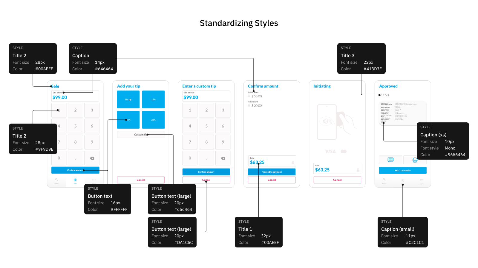
Audited existing screens, gathering common styles and patterns
I audited existing design elements to catalog components and identify inconsistencies that needed resolution before standardizing styles.
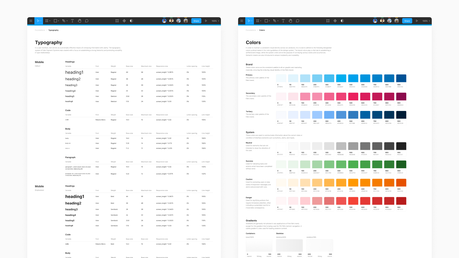
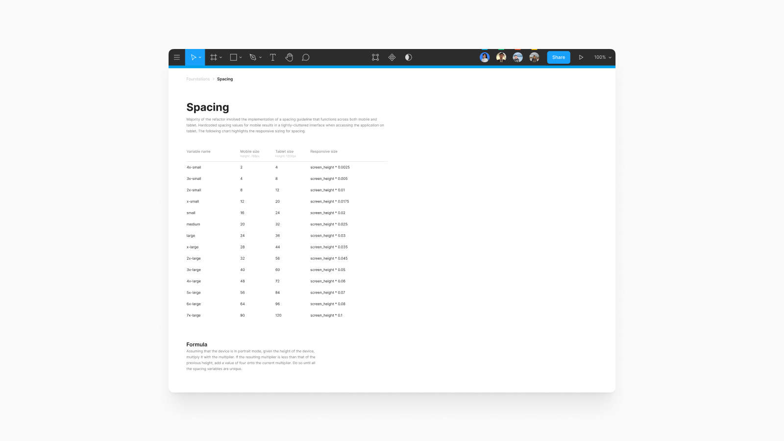
Created tokens for spacing, colors, and typography
This removed the need for developers to hardcode variables, making maintenance easier and speeding up future prototyping in Figma.
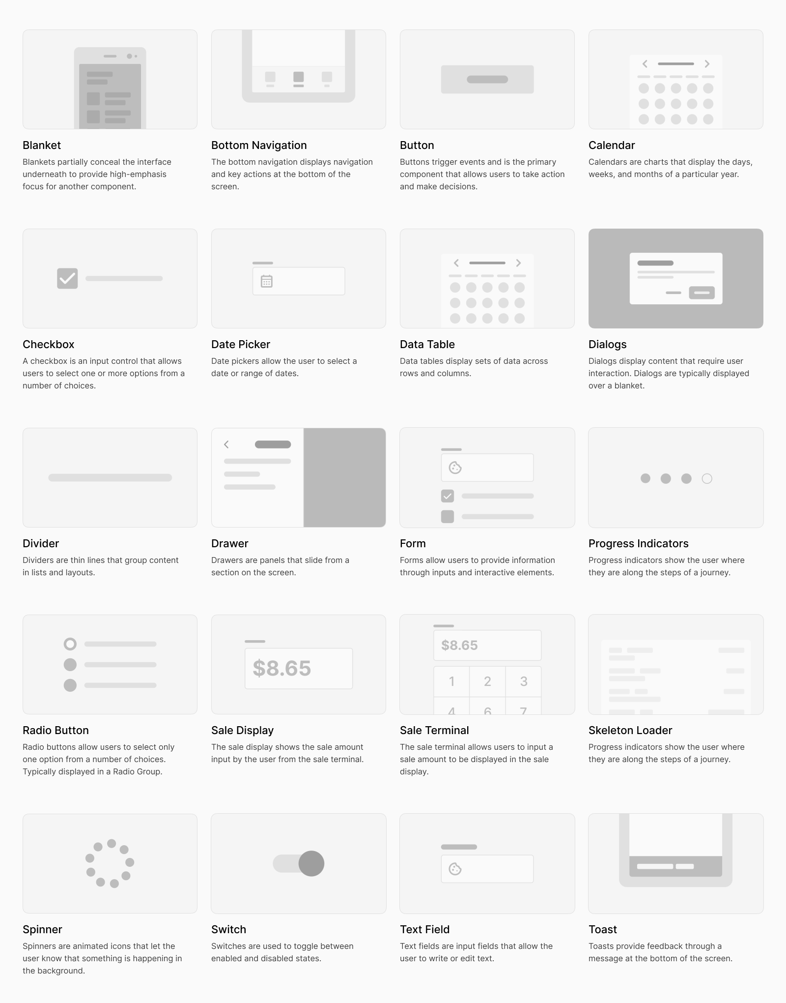
Created a component library and documented 20 core components
I documented the attributes and behaviors of twenty core components — and yes, I wrote these before ChatGPT was a thing.
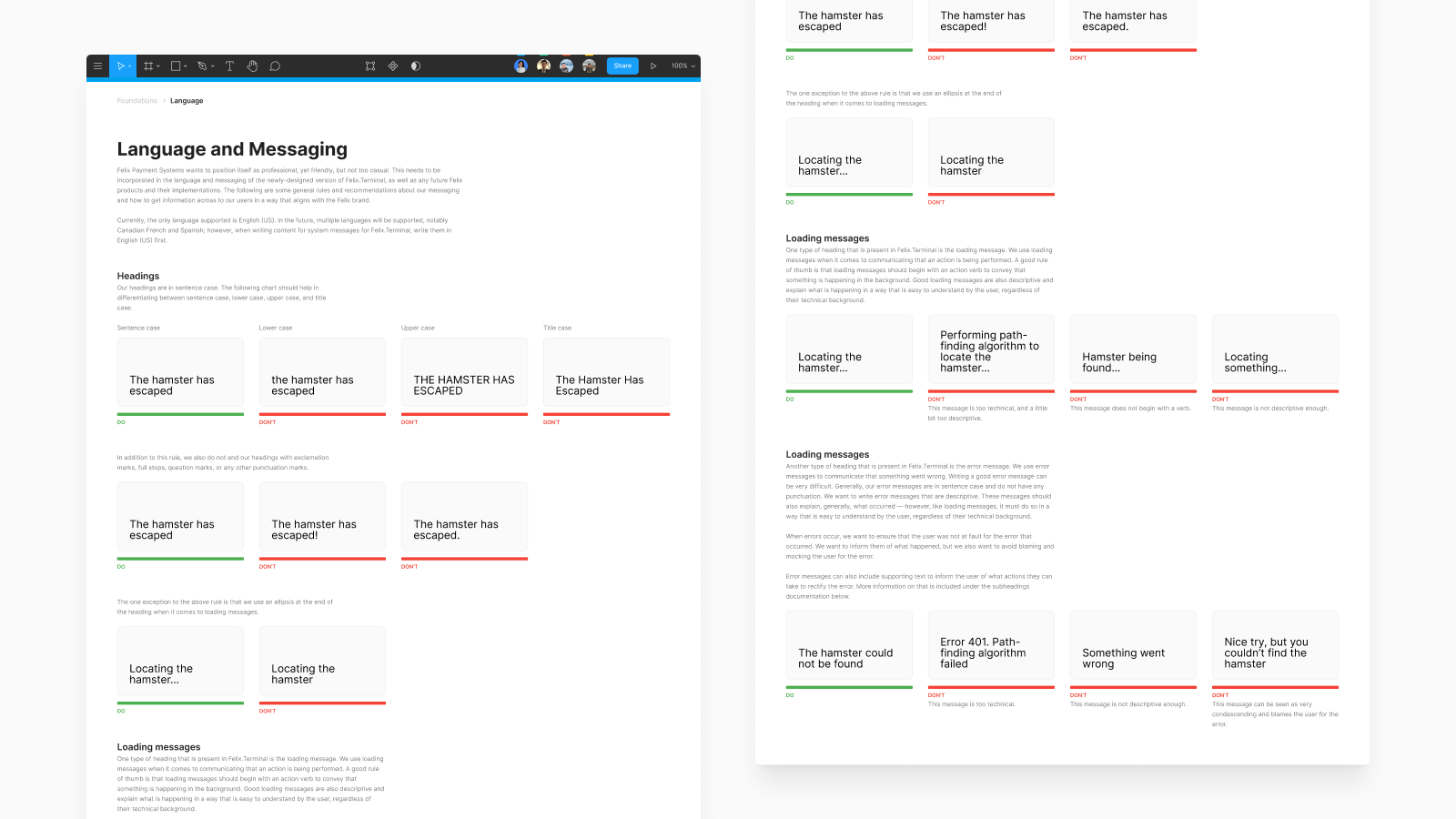
Wrote guidelines for better UX copy and error messages
Clear writing standards helped designers and developers keep product language consistent across Terminal and Portal.
DESIGN PROCESS
Adopting Brad Frost’s atomic design framework
Early on, I adopted Atomic Design methodology, labeling components as atoms, molecules, and organisms. This was helpful to me, the designer for learning how to structure components, but discovered this naming was inintuitive for developers.
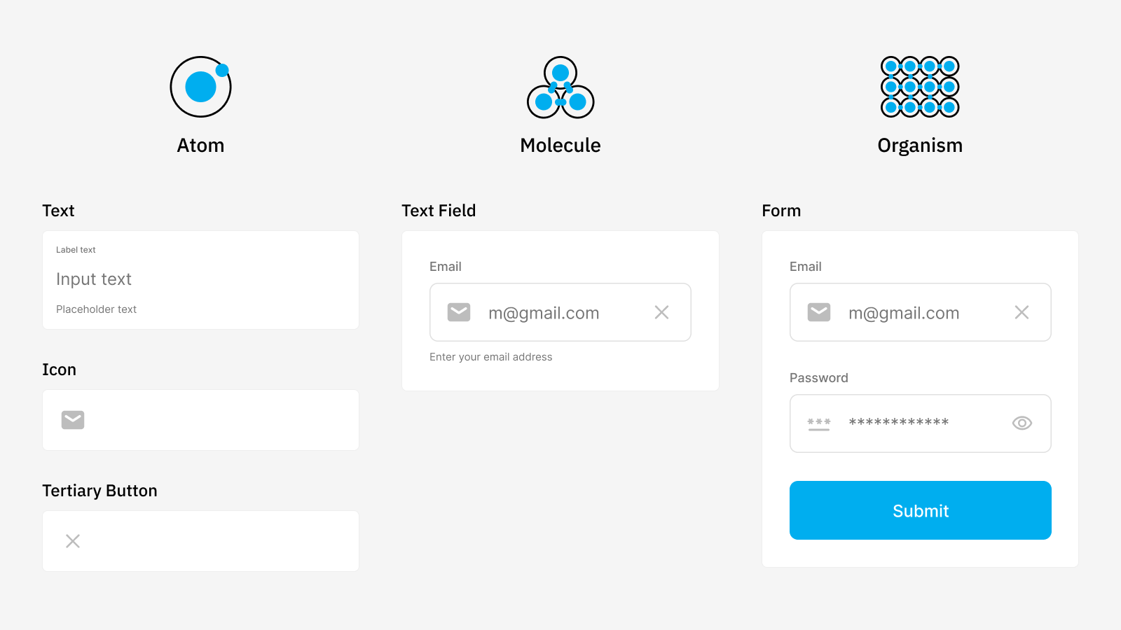
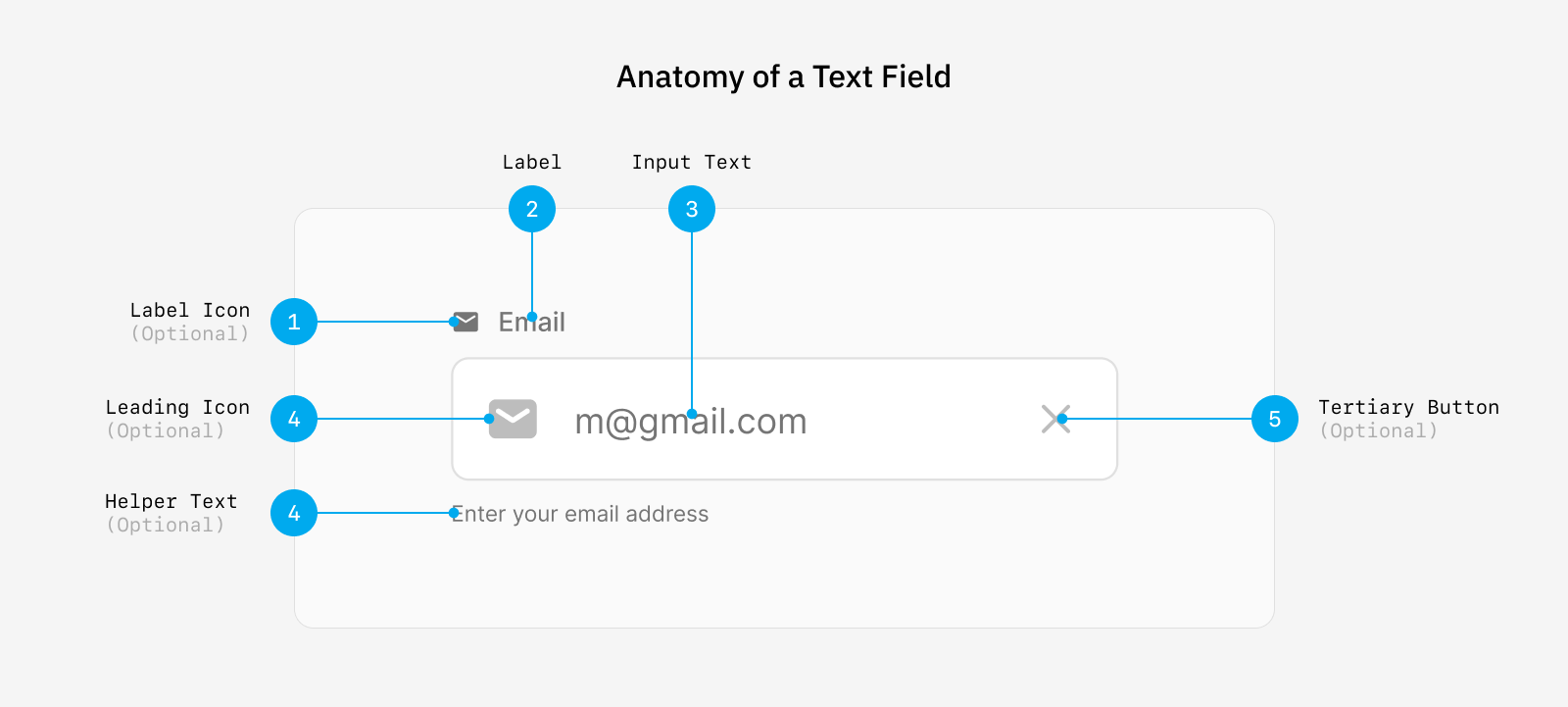
Naming convention was unintuitive for developers, leading me to document components in a way that aligned with their mental models
Developers didn't need to know if a button is an “atom” or a form field is a “molecule.” Rather than forcing the atomic framework, I documented components in a way that made sense to the development team — an anatomy of each component.
REFLECTION
If I had more time to work on the project, I would have…
I’d dedicate more effort to accessibility for both design and development.
For design, I’d create clear guidelines for color contrast, keyboard and focus interactions, and screen reader considerations. For development, I’d host a workshop on keyboard navigability, heading levels, and semantic HTML and ARIA roles.
I’d improve upon the color tokens.
Currently, the color tokens in the design system are only the primitive values. I’d develop semantic tokens to make it clear how each color should be used across components for improved consistency and maintainability.
LEARNINGS
Naming things is hard.
Choosing clear, consistent names for design system components is surprisingly difficult. Names need to make sense to both designers and developers, convey purpose, and scale as the system grows.
Accessibility needs early attention.
Focusing on accessibility early makes sure that every component, from complex forms down to the smallest button, is inclusive by default. This reduces the risk of a retroactive fix down the line which can be time-consuming and costly.
THANKS FOR READING!