Designing a mobile-first experience for capturing inspiration on Figma
Role
UI Design
Interaction Design
Prototyping
Timeline
October 2025
(7 days)
Tools
Figma
LottieLabs, Protopie
Team
Angelina Cao
Emmi Wu
Rachel Chen
As a product design fellow at Silicon Valley School of Design, my team and I participated in a design competition in NYC. In less than a week, my teammates and I ideated, prototyped, and presented a solution to designers from companies like Notion, Apple, Meta, Google, LinkedIn, Reddit and more. Our prompt for this year was
How might we turn idle moments into micro-bursts of creative expression?
We came up with this feature in Figma that extends their existing Comments feature to support annotation with voice notes, allowing designers to capture their ideas on mobile.
My Role
I built most of the interface designs, making sure to align them closely with Figma’s existing design guidelines. I thought deeply about how to extend Comments while carefully the existing interactions in Figma’s desktop and mobile platforms, and also prototyped some really cool interactions using LottieLabs, Figma, and Protopie.
PROBLEM
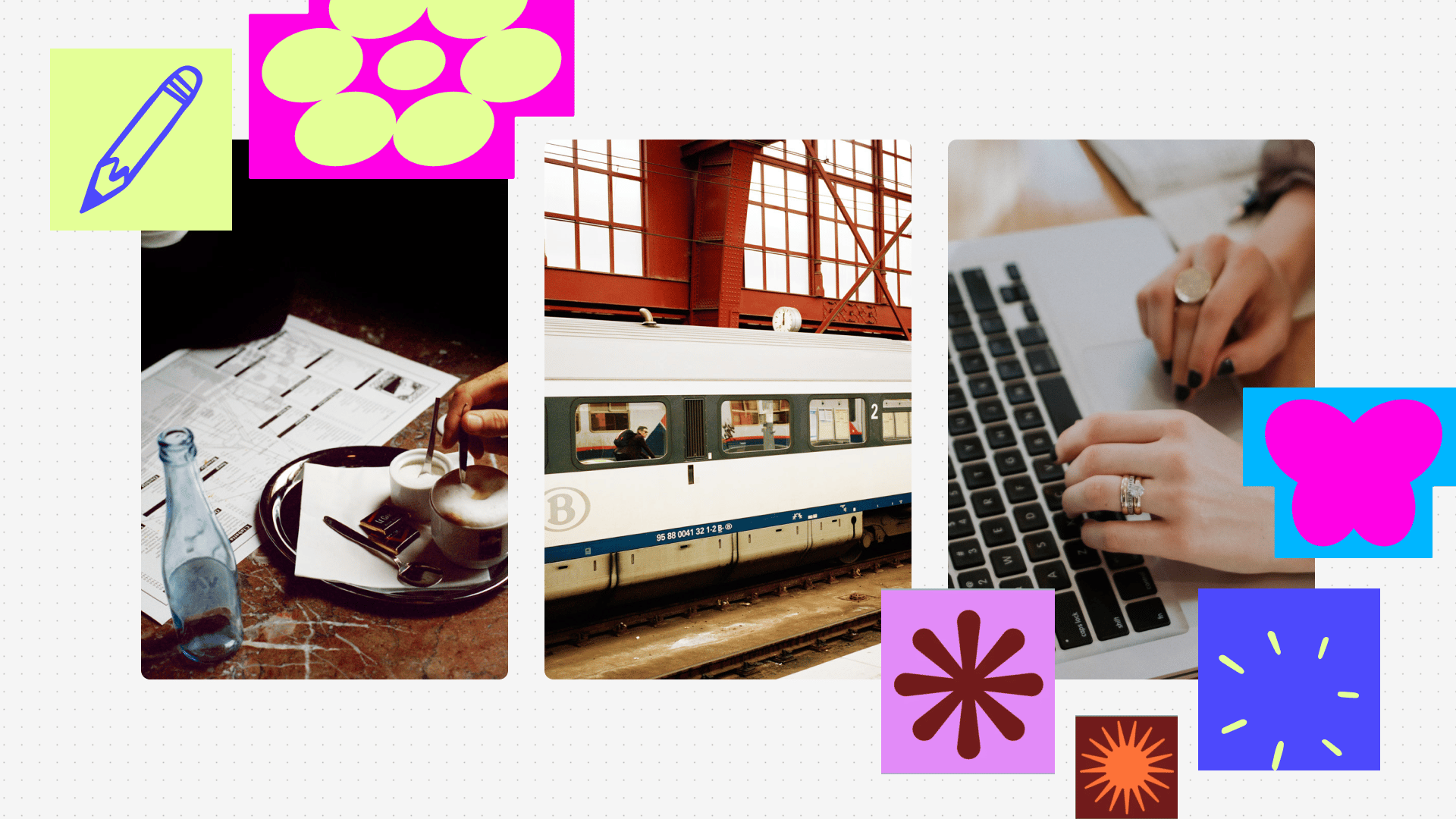
Designers are constantly thinking about their projects.
Whether waiting in line, commuting, or between meetings, there are countless micro-moments in a day when inspiration strikes or a small task could move a project forward.
However, today’s design tools are not built for these moments.
Ideas get scattered across notes apps, Slack messages, screenshots, saved posts on Twitter, or just stay in our heads because capturing or iterating on them requires sitting down at a computer.
What if Figma made it easy to design in short bursts, turning idle moments into creative progress?
INSIGHTS
What makes a good idea?
Ideas should be grounded to context.
When context disappears, ideas lose their clarity and emotional weight.
Ideas should be captured in full.
Current tools force us to flatten complex thoughts into shallow shorthand.
Ideas should be built to build on.
Ideas without depth are difficult to revisit or expand.
SOLUTION
Centralize and maintain the richness of your ideas with Live Comments on Figma
Live comments pair sketch annotations with live voice recordings to create live comments that are easy to capture and easy to understand. This serves as an asynchronous way to share ideas and feedback with your team without losing momentum or context.
Creating a Live Comment on mobile
In instances when you are away from your desk, capturing ideas and feedback starts on mobile. This serves as an asynchronous way to document and share insights with your team without losing momentum or context.
Revisit and replay Live Comments on desktop
When you are back at your desk, review your live comments or your colleagues', replay them for full context, or jump directly to a section that's most relevant to you.
LEARN MORE ABOUT OUR PROCESS BELOW
DESIGN DECISION #1
What types of ideas do designers want to capture?
We knew that we weren’t going to bring the full functionality of Figma into mobile, so we had to be selective about what use cases make sense. We began by exploring a spectrum of ideas that designers would typically want to capture.
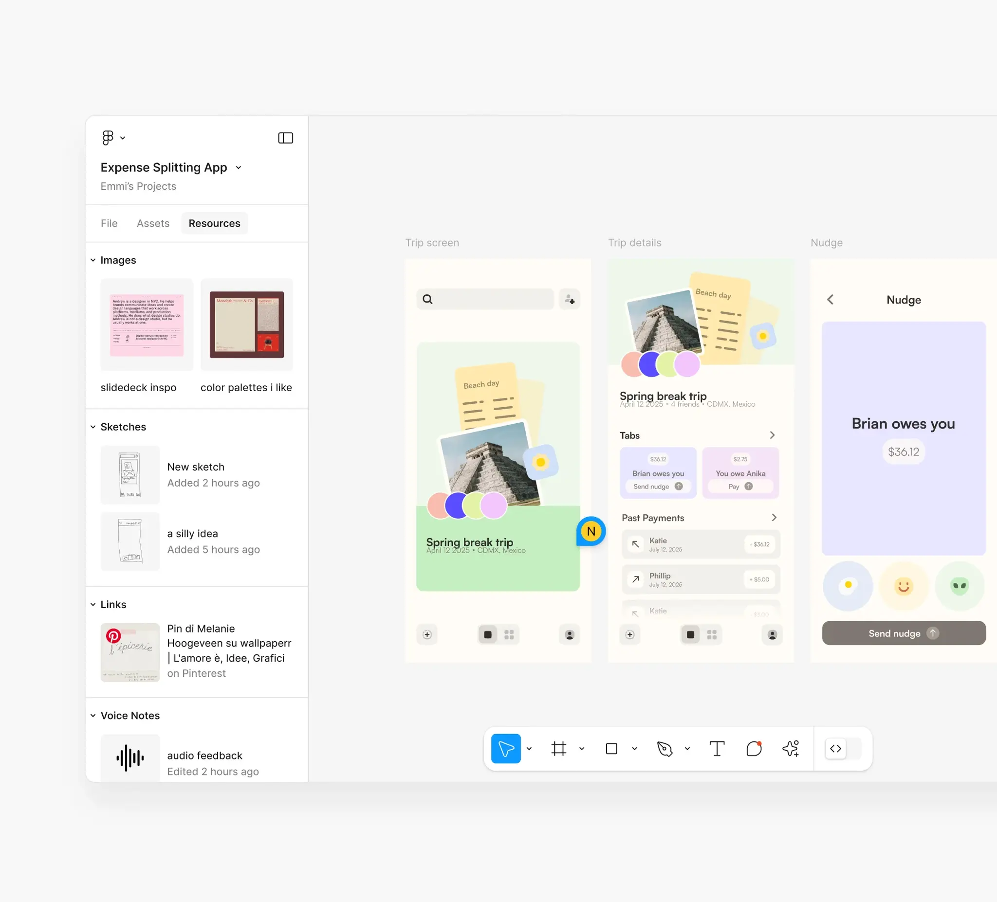
Inspiration gathering
Gather inspiration in forms like voice recordings, sketches, links, and images directly into your Figma file, and have them accessible for you to view and reference from on desktop.
I prototyped this interaction pattern using Figma :)
AI copilot for iteration
Another interaction pattern we thought about was around an AI copilot that takes in text prompts and generates ideas, edits, and iterations on your existing designs.
I prototyped this interaction pattern using Figma :)
Visual annotations paired with voice notes
We landed on combining annotations with voice notes, as we found that this pairing of was really powerful for quickly capturing high-fidelity ideas that are easy to understand and reference later.
Moreover, we believed it was the most meaningful way to move forward in a project and be most valuable in a work context compared to the previous explorations.
DESIGN DECISION #2
What is the best way to navigate on mobile when adding Live Comments?
For feedback to be clear and understandable, it has to be tied to the right part of the file. But on mobile, the canvas is not the easiest to navigate, making the actual navigation of the file a big barrier to capturing ideas and feedback.
So, we explored four forms of interaction:
Figma Feed
Figma Feed uses AI to group related sections/frames together, allowing you to vertically scroll to view them (similar to reels/a feed).
Mini Map
With a Mini Map, users can click or drag on a scaled overview of the entire canvas to pan to distant areas without manually scrolling. I prototyped this interaction pattern using LottieLabs :)
Lasso Checkpoints
Lasso Checkpoints allow you to select areas to go through in sequence, give you the flexibility to navigate design files, group content, and set their order.
Snap to Frame
We decided to go with a Snap to Frame interaction, where you'd double tap a frame to lock in on the view and quickly focus in on it to annotate.
DESIGN DECISION #3
How do we make it easy to understand and respond to Live Comments?
We want Live Comments to be easily glanceable while making sure you can understand the full context of one… and just thinking about the context of use of Live Comments — it can be really long and messy.
I designed the UI for these directions in Figma as a proof-of-concept to initiate this discussion with the team.
One Live Comment = multiple comments across the canvas
At first we thought of segmenting a Live Comment into different chunks, so that each section was mapped to its own annotation in the canvas. However, we realized that this could actually impede collaboration, as it'd be difficult to discern which Live Comments are grouped with each other.
We landed on auto-creating sections within a Live Comment.
This approach is more consistent with the current experience of commenting, but this does introduce a tradeoff of users being unable to respond to smaller snippets of ideas within a longer recording.
OUTCOMES
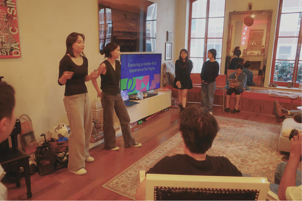
After presenting Figma Live Comments to some of the biggest names in design, the votes were cast… And we won!
After zero hours of sleep and my teammates suffering some unexpected, unfortunate effects from the coffee they drank (not me though, stay safe) we presented our project to a group of talented designers in New York.

LEARNINGS
Aggressively explore a wide range of ideas
This project challenged me to think beyond the first, obvious solution and explore a wide range of ideas to make sure that the final direction is battle-tested and well-considered.
Move rapidly from lo-fi concepts to realistic, high-fidelity artifacts
I learned it's easier to react to artifacts that feel real, so this project pushed me to create high-fidelity artifacts as early as possible to shorten feedback loops and help my team evaluate the solution.
THANKS FOR READING!